Tutorials
Our first task of this unit was to mess around with the lightness of a certain picture using tones and levels to bring out certain parts of the picture. As you can see the picture below, I've used the tones and levels in this photo to bring out the sky and to make the grassland a lot more real and gives it that grassy feel and colour, I've also made the monument in the picture to give it a light feel around the bottom and a dark feel near the top for it to create a shadow effect and for the top to seem a lot darker. I've liked doing this task and this would help me for future work if I wish to mess around with the lightness to make certain parts stand out.

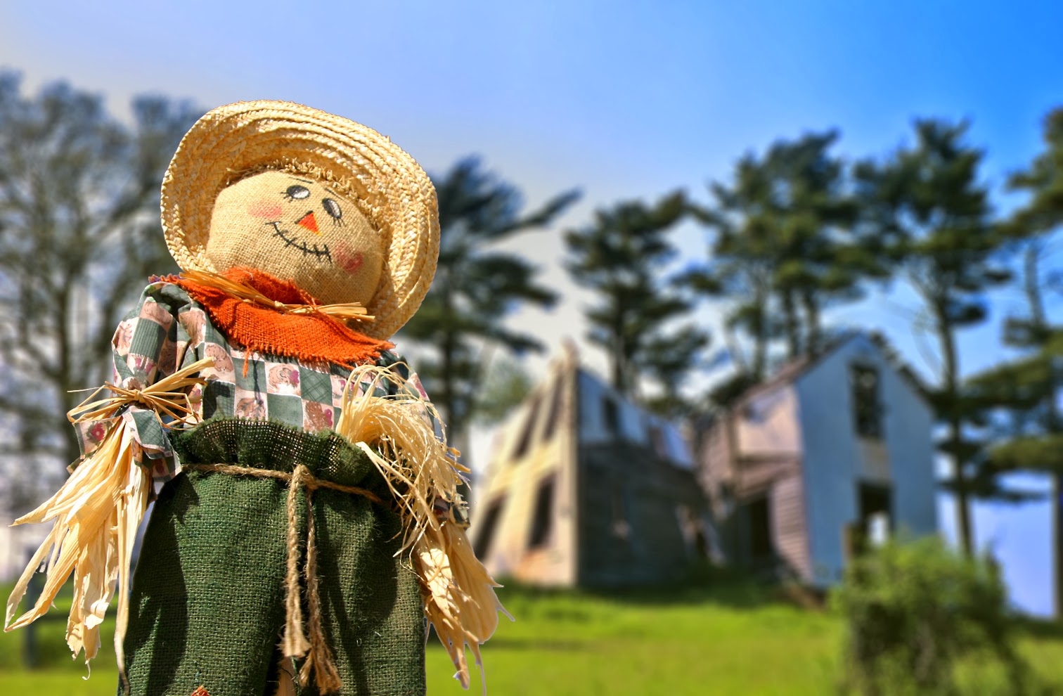
The next task we began working on was to work around view distance and to see how field of view works in pictures, we also learned how to grab certain parts of pictures using the magic wand tool and how to make a picture seem quite blurry giving the great field of view effect as if something was more in focus than something else in the picture. For example, in the picture below, we made the background of the farm a lot more blurry and to seem as if it was really far away and adding the scarecrow to the picture in a high quality for it to stand out and seem it was right next to the person taking the photo. I feel this is a really good technique to learn especially in games design as this would give a great field of view effect for if someone was to make an area and design it in Photoshop or another picture editing program and for it to seem a lot more lifelike and real as if someone was looking at it from a specific distance so this would help definitely in the future
Our next task was learning about many different special effects and how to use shadowing to an advantage to make something seem real and for the shadowing to make it stand out very well, the design we had to make was a fly coming out of a cup of coffee. We first began with taking the fly from a previous photo and using the magic wand tool similar to how we got the scarecrow in the previous task. We then placed it in the coffee cup and used the brush tool to create a shadow effect by changing the opacity by 10 each time. We then added ripples to the cup for it to seem as if it was moving around inside the cup and then we proceeded to add a shadow to the leg on the cup using the brush tool and following the trace of the leg for it to seem lifelike and real. After we finished that, we then began to work on giving the plate in the picture a bit of a shadow as if someone was taking a picture of it. We learned a lot from doing this taks and the special effects such as the ripples in the cup make the picture that much better and looks visually appealing. Overall, I enjoyed this task and the techniques I've learned will help me in the future.

As we finished the work quite quickly, we went back to the scarecrow design to change the smile on the scarecrows face to make it seem like he has a sad expression on his face. At first we were unsure on how to do it but we eventually learned how to using the clone tool. We first began on grabbing the mouth using the magic wand tool and then moving it away from the actual scarecrow, we then used the clone tool to grab the skin colour and then go over the skin to make it seem like he had no mouth at all and we then used the free transform tool to flip the mouth to make it as an upset expression instead of an happy expresion and then moved it back onto the mouth. This was good for us to learn as it helped us learn that sometimes we have to gather our own research rather than asking our teacher for help all the time on how to do something specific and that we would have to learn it for ourself. Below is the finished picture with the scarecrow having a sad expression.
.jpg)
Once we had finished these tasks, our final task for the day was learning about greyscale and different colour techniques such as RBG etc. We first had to choose an image of an animal that we wanted to work with and to give colours to, for my design I chose to do a frog as I felt that adding colours would work well and give it that feel that most frogs have with the weird and messy mix of colours. We put the image into a greyscale image for the black and white feel and then proceeded to change it to RBG to be able to use other colours instead of just black and white. For my design, I used a different mix of tones and colours for it to seem realistic and I feel it turned out really well and I like the different colours I've used such as the blue legs matching with the blue eyes and giving the nice tone of orange and blending it in with the red mouth. I really enjoyed doing this task as from an art perspective, it's nice adding a different blend of colours to mix and match and not just one bland colour for the whole design that seems boring. Overall I enjoyed this task and learning these techniques will definitely help me in the future for when I'm doing more artwork.

As homework, we had to make a design on Photoshop using the techniques that we learned that day such as layer overlays, shadowing etc. We had to make a design consisting of two fruits with one of the fruits being unzipped into another fruit. We could do this with many different fruits such as an apple into an orange or vice versa. For my design, I decided to do a watermelon unzipping into a pineapple. I feel that the actual design turned out really well and looks like a really interesting design. As a personal touch, I added the black background to make the design stand out in general and felt that it does stand out really well. Overall, I enjoyed doing this piece of homework and has been useful to help practice my Photoshop skills.

Our next task at the beginning of our next lesson, was to make a surfer banner that would be used for advertisement for a website or a shop. We first began this task by making a transparent page on a Photoshop for us to be able to make the banner with by a 25 x 5 page and began to drag each of the photos into this new page. On this new page, we then began stretching the photos to make them into the banner and have them aligned to look like a banner. We then proceeded to add a transition effect to each of the photos so that it looks a little more professional and would seem like a believable banner. Once we had that, we finished the task by stretching the logo a bit to fit into the black square on the right of the banner. This was a good task to learn as it helped us learn layer masking which is very useful for many different effects and works really well with a lot of designs. Overall, I enjoyed doing this task and has helped me learn quite a lot.

Our next task was to make a sort of movie poster using three pictures and using the layer mask technique to create a fade effect. For my poster design, I used the two pictures at the top and at the bottom to create a sort of effect as if the businessman in the picture is thinking about his work and a dinner date as it matches the worried expression on his face. This task was good to learn as it helped us more learning about layer masks and using the gradient tool to stretch the photo to make a fade transition effect between the three pictures. Overall, this was a good task to learn and helped us learn gradient masking even more and more in-depth.

Our next and final task for the day was to make a red sky sort of picture with a moon creating a beam onto the road. We first done this by grabbing the moon with a selection tool of our choosing such as the magic wand or the selection tool, I used the selection tool as there is a tool under the selection tool known as the Elliptical Marquee tool which is similar to the normal selection tool but creates a circle instead of a box. I took the moon and took it into this picture and began editing it using match colour tool and to match it so that there was a dark red tone to the picture or using any colour of our choice to give it that tint to the design. Once we did that and had the colour match with the design, we added a beam from the red moon to the road using the rectangle tool and to fill it with the paint bucket tool and to lower down the opacity to make it seem like a beam. This task was good to learn the match colour tool and it really does create a good effect to a design if you're wanting the design to be the same colour with different tones of that colour. Overall, I enjoyed this task and would definitely like to use this tool in the future.

For our next piece of homework, we had to mix two environments together to create a completely new environment that would seem realistic and something that someone could imagine. For my design, I mixed a home next to a large piece of land with a night-sky with an added moon and shooting star in the background. The first thing I did on this design was to get rid of the unnecessary land in the background of the house image as I was going to add a dark night sky over it for the look that I wanted. I then edited the rest of the image to give it a dark, shadow tone to show the darkness hitting it as you can see on the grass getting darker and the darkness on the windows of the house. After I got everything, I then proceeded to put the night sky in the image and position it correctly to suit the image and added the moon and shooting star using a selection tool to grab it from another file. Overall, I was happy with how this ended looking out and thought that it seemed very realistic and something that someone could imagine. This task was also good as it allowed us to put most of our skills that we learned during our previous lesson to the test and tested our imagination to create something that would seem realistic. Overall, I am happy with how this looked and would like to do something like this again for if I was to create concept art for a video game or for another design.

Once we came back for our next lesson, our first task was learning about different blending modes that Photoshop has such as to darken a specific part of an image or to make it lighter. To be able to do this, we selected a specific part of an image using the selection tool and then to use the layer via copy tool to still keep the original image but to make a copy of the layer using the selection that we wanted. Once we had this layer, we then went to the different blending modes and added different ones of our choices that went well with the image or to create something completely different by editing the image a tiny bit. This is a really good technique for use on certain images such as making a specific part lighter or darker as I've mentioned before. Overall, I'm happy with how the images that I changed around look and happy that I learned this technique for future work.

The next task we began working on was very similar to how we did our homework by mixing two environments together to create something completely different. For this design, we had to mix a sky from one picture with a field from another picture and merge both of the images together and to add a sunset, night, day feel to the picture of our choosing. To start it off, we had to erase a part of the field picture to get rid of the sky to add a different view of the sky that would impact the picture later on. Once we had did that, we added the sky into the picture and blended it in with the field by blurring it a little to give depth of field view. Once the sky was blended in the field and looked good, we changed the design's colour to something of our choosing such as a night sky or a sunset etc., as you can see with my design, I've gone with a sunset sort of feel. To do this, I had to change the levels and curves of the picture to darken the sky and lighten up the field a little and once I had the colours that I wanted, I added a square of colour over the whole picture of an orange blend and lowered down the opacity for it to blend the rest of the picture in that orange tone of colour. I really enjoyed doing this task as it taught us how to blend two different pictures together and how tones and colours can drastically change a picture. Overall, I was happy doing this task as it allowed us to be able to mix environments for future work that we may want to do.


One of our pieces of homework was to create a design based around what we learned from our previous work. In this task, we would be experimenting around with different blending modes, colours, brightness/contrast, gradients and other tools that would allow us to create our design. The main purpose of this design was to make our own street of London design in our own image so that all of our designs are not the same colours, using the same tools etc. This allows us to experiment as said before with all of the tools that we in Photoshop that we learned. I'm happy with how my design turned out and I like the different things that I've added. I feel the colour with the green and yellow mixed together creates a trippy, hallucinogenic sort of feel to the picture and I feel it turned out the way I wanted it to. I also like the words that I've added such as the 'West End Final' at the top with the colours mixing into the design. I also like the Lost word that I added sort of similar to how stop is written on a road and implying that the person on the motorbike could be lost. A new tool that I learned through doing this design was the perspective tool allowing me to create the lost word and lay it down onto the road. Overall, I'm happy I've done this design as it allowed me to learn all of the tools that I learned throughout my tutorials to then be able to make into a final design which I'm proud of.
.jpg)

One of our pieces of homework after the lesson was to learn about how people manipulate words and add effects to them, we were shown a list of different tutorials that we were able to do and began working on them. The one that I chosen was based around the word 'fear' and I used the selection tool to create cuts in the letters to be able to then make into new layers and rotate them around. I also used the stroke tool and giving it a gradient as you can see with the red outline around the edge of the word. This was a good task to do for our homework as it creates emphasis on a specific word that you may have and can give it quite a lot of detail also. Overall, this was a good task for us to learn and can allow for a lot of detail to be able to use for posters and other designs that may involve words.

Another piece of work that we did during class was very similar to our piece of homework that was about how to manipulate words and adding effects to them. With this design, we began working with images and placing them into the letters, similar to how we did the task with the sunglasses. We also used real images from the internet also to give the words more depth and meaning and added a drop shadow and gave it a nice background to go with the design. Overall, this was some extra help on how to learn more on manipulating words and giving the designs a lot of detail to use.

One of our main pieces of work that we did in this unit was to create a summer collage out of some resources that we were given. We applied a range of effects to the college to create a picture that depicts summer, we then blended each of the pictures together so that it all goes together, I then added a colour layer to the picture to keep that vintage feel and for it to seem quite old. One of the main goals with this task was to make it look as close to a photo as possible to give it that vintage feel as if it was took on a beach. I feel that this task was quite fun as this is the first collage that many of us may have done before on Photoshop and was enjoyable to do as it helped us learn what specific aspects go into making a collage that is appealing to the eye and looks just visually appealing in general. Overall, this was a fun task to do and was very helpful in us learning how to make a good collage.


Our next task on Photoshop that we began doing was to create a poster collage using different resources from magazines and other pieces of media which may be of some use to us. For this task, we created a poster or collage for a festival/carnival from anywhere in the world. For my festival, I and a friend of mine did it based off the Chinese carnival known as the Lunar Carnival which celebrates the new year for the Chinese culture. Once we submitted it in, we had a few problems with our poster and would do a new poster as you can see below. Some of the problems with our poster included that it had too many focal points and would feel quite messy, another problem being the contrast and brightness making some objects stand out way too much and some seeming really hard to see such as the chandelier under the moon. One of the real main problems about the poster also is that it never really said what the carnival or festival was and would leave people wondering what it was celebrating which didn't help at all. Once we knew how to improve it, me and my friend began working on our next draft and called that our final one. As you can see with the final one, it has the main focal point being the moon which is used as an L and a C for Lunar and Carnival which we feel was quite a nice touch. We also added some small fireworks to represent stars in the background also for it to feel like it's in the night sky and we added banners also which is what the Chinese would use for a lot of things such as lanterns which are used heavily in the festival. I feel that this was a good task for us to learn and was very helpful in learning more about collaging and focal points to create a very appealing poster for people to see. Overall, this was a good task to learn and would help us greatly for the next few tasks to do.


Our next task we began working on was very similar to one of previous tasks which was about creating a vintage collage based around a holiday sort of event. This time, we worked on a poster that would be relevant to a holiday that we went on in the past. For my poster, I did mine based off a Caribbean cruise that I went in during 2011, one of the themes that I wanted to use around it was to have it as a sort of treasure map talking about the different places that I went to during the holiday and I feel I did that in some sort of way using pictures that I took and then done little lines to connect to each other similar to how a treasure map would look. I also faded the different images to make them seem withered and to look good on the background which would look like some sort of parchment or withered paper similar to how an old treasure map would look. Overall, I'm happy with how this design looks and how it came out and fits the treasure map theme very well.


Our final tutorial that we developed on focused around doing a collage using a list of different resources for us to use and was really considered a test more than anything to show that we knew how to work Photoshop to a good standard and for us to learn how to make a collage to a very high standard using different tools and techniques such as layer effects and changes to colours. As said before, this was mostly a test to prepare us for our final project and for us to remember the techniques and tools that we've been using to our advantage and creating a very interesting design using the focal points to make it stand out and to give the picture a meaning or a moral. This design really helped us grasp the final things we needed to learn about Photoshop and about creating a very good collage as well. Overall, I'm happy with this task and the previous tutorials that we worked on and feel that I and many other people have a good grasp on Photoshop now that we know the different tools and techniques used in making designs.

Final Project: Digital Art Collage
Moodboards of Collages with annotations about the focal points and about the different pieces of details that are in the collages, as well as the techniques used to create some of them and what the collages are trying to represent.


This moodboard is of six pictures and learning about different focal points in collages and what attracts the person's eye in what order. I labelled each different focal point from 1 being the focal point that people would notice to the last number being the last focal point that people would notice.

These are some childhood games I wish to cover in this collage. This also gives me some ideas of what sort of art style I'd maybe use for my collage.

This is the type of television that I would like to use in my collage for that nostalgic feel of when people used to play games on these sort of TV's known as CRT Tvs.

Would like to add box art to my design as well of old PS1 and N64 games that I would add lying on a floor or scattered around.

Old controllers that I would also have lying around or scattered around the design next to the console or boxes of games.

This is my first proposal for my collage design, I will be editing this proposal as the project goes on with any new ideas I come up with and will write it in a different colour to show that I've edited it.

These two moodboards are for visual representations to give me ideas for my collage and the different art styles and techniques used in these collages that I could use for my collage.


Below are some images that I would like to use in this sort of perspective, style and other techniques that I feel could benefit my collage greatly, this is not saying that I will be using these pictures as I will be using my own resources, these are just for reference and to see what I could do in perspective, view style etc.

.jpg)
.jpg)

.jpg)
Below is a small task we did which we feel would help us for making our collages, this task involved us gathering different pieces of art from different art movements such as surrealism, cubism, pop art and more based around our subject, mine being based around gaming and I collected different pieces of art movements which I feel could give me some inspiration on making my collage that little bit better and if I could use any of the art styles of techniques.

List for next Wednesday
- Console Images
- Textures
- Will have my initial ideas ready so I know what to do for my final idea
- Game Cartridges and Boxes to use around the collage
- Controller Images
- CRT Television Pictures
Updated List – 7/5/2014
Need Console Images,
Controller Images and develop initial ideas, make drawings if I cannot gather
resources.
A Digital Artist Research & Critique
A Digital Artist Research & Critique
[P1 M1 D1]
Jerry Uelsmann
Art Critique
Jerry Uelsmann is a popular surrealist artist from
America and is very famous for his collages covering surrealism and
is also known as the 'Pioneer of multilayered images'. In this
article, I will be talking about a few different things in this
article such as why his work is topical, what techniques he uses, and
what forms and content he explores in his pieces of work.
Jerry's work is very topical in different aspects. As
said before, he is considered the pioneer of multilayered images and
was very ahead in terms of his work than anyone else in the industry
at the time. He is also popular due to this as he had no use of
Photoshop or any editing program during the time and has layed it so
skillfully to look even better than something done in Photoshop or
any editing program. His collages involve using black and white
images and uses negative space to create his pieces of art that are a
mix of different images such as trees, rocks, water and human figures
in interesting ways that leave a certain meaning to the viewer.
Talking about Jerry's form in term of his work, he uses
photographed images of the different pieces of images in his designs
and uses very interesting techniques. One of the main techniques that
he uses to create his picture is that he makes it in a darkroom and
uses masked negatives using several enlargers and moves the paper to
show each various piece. He uses blending also by dodging and
burning, similar to how it's done in Photoshop and other editing
programs. Through content, he depicts most of his work to 'allow the
viewer to transcend the frames and take them on a journey through the
unfathomable', his work also plays on very big ideas and he believes
that his work touches the viewer on a personal level and communicates
with them through emotion through the settings and environments that
he creates.
Jerry's work relates to previous traditional art forms,
one of the most popular in his artwork being surrealism which he
covers quite a lot in his work, he also covers a little bit of German
expressionism from how dark his picture can be and the atmosphere
that they create for the viewer and does a very good job of it by
creating pieces of work that looks like it could be from a dream
which captures that surrealism essence very well. He was inspired to
do his artwork from when he saw a nude female posed in a highway and
noticed a flaw with the picture and felt that he could do a better
job and wanted to redo photographs that other photographers had done
to see if he could make them better also. He was inspired by popular
surrealist artists in the industry such as Man Ray and Herbert Bayer
in terms of their view of reality, time and space.
Nowadays, his artwork is noticed and has inspired a lot
of people to do photography and create collages through the means of
surrealism and other artforms and some people embrace his techniques
also such as him being in a dark room to get his ideas and to be able
to experiment with those ideas also. His work has been used also in
the opening of the TV series 'The Outer Limits' and through a
illustrated edition of Stephen King's 'Salem's Lot'. It is also used
in as a album cover known as Train of Thought by the metal band,
Dream Theatre. His work is very inspirational and I feel that it will
inspire a lot of new artists wanting to get into photography and into
making collages through his work and through surrealism and German
expressionism.
Overall, I really love the work that he does and feel
that his content really gets to the viewer through very strong
emotions which the view that Jerry wants. I also feel that it's
construction, aesthetics and it's storyline are very heavy as well in
his artwork and, again, get to the viewer using very strong emotions
and to make them see a different perspective to what they would
normally think when looking at one of his pieces of work. He is a
inspiration to people who want to do photography and to people
wanting to get into surrealism and German expressionism in all sorts
of media.
Completed Image Gathering Collage
[P2, M2, D2]


Step-by-step production breakdown
[P2, M2, D2] [P3, M3, D3]
I first began doing some sketches on different ideas that I could use for my collages with annotations describing the different aspects of the collage. Once I knew what to choose, I decided to end up using as reference for my final collage and to be able to know what to do next with my collages. The ones that I've chosen was the bottom left and the middle left.


First Collage
Pictures and Resources Used


I first began doing some sketches on different ideas that I could use for my collages with annotations describing the different aspects of the collage. Once I knew what to choose, I decided to end up using as reference for my final collage and to be able to know what to do next with my collages. The ones that I've chosen was the bottom left and the middle left.
First Collage
Pictures and Resources Used


+snap0000.jpg)
+snap0001.jpg)

+snap0000.jpg)

The Design

With this design, I wanted to get across the mind of an old school gamer and someone that has a lot of nostalgia for old school games during the Nintendo 64/PlayStation 1 era of video games. To begin with, I took the picture of myself above and cropped it down so it was just about half of my body and cut the background for it to just be me, I then silhouetted myself using the paint bucket tool to go over myself and then added a drop shadow to it to give it more depth and added a stroke over it also to make it look a bit nicer. I wanted to add this to my collage as I wanted it to show that this person could be anyone and could be an old school gamer that is into this era of gaming or a new gamer wanting to get into this era of gaming.
Once I added that, I then added the red carpet texture above to go in under the two black lines. The reason for adding this is to give it more of a feel also of the person being a kid and playing it on this sort of flooring or on a wooden flooring when they were younger. I feel that this gave it a lot more depth and would make sense in adding it and would suit the collage well. I used the brightness and contrast tools to blend it well for what I was going to add next and used the colour balance tool also. I also used the multiply on the layers that were used to for the carpet to make it a bit more darker and stand out a bit more with the silhouette.
Once I got the red carpet texture right, I then cropped a bit of the silhouette's head and used two lines using the line tool to sprout off into the different corners as if he was thinking about the games in the picture. I then began adding some screenshots that I took of different game title screens from the Nintendo 64. The reason why I did game title screens was because that, this would be the first thing the person would see when they first load up the video game and would get them excited to play the game. I used different tools to blend the title screens together instead of just mashing them together such as the blending and gradient tool and getting it just right so that it looks a bit more professional. I didn't use anything to change the colour of the layers or the type of layer as I feel that the pictures would lose a lot of their aesthetic and other features.
Another type of layer that I also added to my collage was colour layers to be able to mess around with the brightness and other effects using a different method. I ended up using green, yellow and blue colours in my collage. Another reason I did this also was to make them seem like moods and base them off different moods such as yellow being a bright and happy colour. Mixing these around really worked to how I wanted it and worked well overall.
Another type of layer that I also added to my collage was colour layers to be able to mess around with the brightness and other effects using a different method. I ended up using green, yellow and blue colours in my collage. Another reason I did this also was to make them seem like moods and base them off different moods such as yellow being a bright and happy colour. Mixing these around really worked to how I wanted it and worked well overall.
Once I had that all sorted, I feel that the picture was missing something and decided to look online for some textures that I feel could suit my collage well. I ended up finding a texture on DeviantArt that I really liked and suited my collage well which was called 'Retro_Texture' by a artist known as WingsOfAHero so big thanks to him for allowing me and other people to use this texture. Instead of just using the basic texture and just throwing it onto my collage, I wanted to make it a little different but still look the same. Below is what I changed it into compared to what it was above in the pictures and resources used section. As you can see, a lot of differences have been made and I've added a lot of effects to make my version of the texture different such as duplicating layers, adding curves and colour balance, changing the type of layer etc. This allowed me to be able to make a texture that I thought will match my collage well and suit the aesthetic well also.


Before After
Once I had put everything together, I then handed the version I had back to my teacher for feedback and was given time to improve on it and make it a lot more better to be able to achieve a higher grade.
Improvements

One of the main flaws with my collage was the fact to do with my screenshots which could be considered plagiarism as people may think I'm taking them from a different source and not gathering it myself. I also wanted to change it so that the person wasn't just thinking about video games and was thinking of drawings that he did of iconic things from video games such as Mario's hat or Link's sword.
I feel that my design looks a lot better now as it gives the picture a lot more depth and makes it so that it isn't just video games that he was thinking about and was thinking about old drawings that the person enjoyed doing. It also properly conveys the focal point and message very well now and makes it a little bit easier to understand if someone didn't understand it.
To be able to create this, I began by drawing out the objects onto a piece of paper by looking at the different screenshots of video games and thinking of items from the video games that are quite iconic and popular so that people who haven't played the video games would still know the items. Once I did this, I then imported it into Photoshop and added colour to it using the brush and paint bucket tool. I feel this was good also as, even though the drawings are not amazing, it gives it more charm as if a child drew it and in this picture, I did it so that the person found his old drawings that he did of different video game items which is how it looks the way it is.
Other than this, I feel my collage is vastly improved now and looks a lot more visually appealing and the message conveys itself a lot easier. Overall, I'm happy with how this design looks and how it turned out for me.
Second Collage
Pictures and Resources Used


The Design

With this design, I wanted to get across the sense of immersion with video games and the sense of immersion that young players would get playing games during the Nintendo 64/PlayStation 1 era of video games. To begin with, I began duplicating the TV screen and making them smaller and smaller as if it was zooming in.
Once I did that, I then added the static like texture into the screen, before I did this however, I wanted to make the static texture a bit darker as I felt that it was too bright for the design. Below, is the before and after version of the static texture, I used tools such as the linear burn and colour burn that I feel made the design a lot darker and made it a lot more effective to use in my collage.


Before After
Once I had added that texture into the collage, I feel that it was missing something and needed a good texture to go along with it. I decided to use the texture that I had used in my previous collage as I felt that the sense of immersion was quite good in that collage with all of the points focusing into the middle.
Once I had put that texture in, I handed the design in to my teacher and was given a lot of feedback on how to improve as this wasn't fully understandable on the message of immersion.
Improvements

As you can see, my improved version is very different from my previous version, I felt that my previous version after looking at them myself and getting feedback from my teacher and noticed a lot of errors and how the message doesn't convey itself properly.
I first began by getting rid of some of the TV frames as it wasn't very organised and looked quite messy once more and more were added and wasn't lined out properly. It also stopped me from being able to do my new design as I needed as much space as I could for the screen.
I also removed the textures I had as, once it was printed out and I fully looked at it, the design looked very weird with it and just seemed very out of place and may of conveyed the message in a weird way that people may of not understood, so I felt it was best to remove it.
I also changed the message quite heavily in this design also. I used the image of when a channel is off-air and wanting to add gaming relevance to each individual bar, for example with Sonic on the right with the blue bar and with Kirby with the pink bar. I feel that this was a very creative method and, even though my message is different now, it still looks visually appealing and very creative overall.
I also used some of the previous drawings that I had also used in my previous collage as I felt that this would still give the childlike message across and still conveyed the message across very well of that people used to play games on this sort of TV and that it would give them nostalgic memories back if they saw these TVs again.
I feel that this got rid of a lot of disadvantages that my previous design had and actually conveys a message very well for people to understand and still be visually appealing. Overall, I'm very happy with my design now and feel it has improved vastly from my previous design in a load of different aspects.
Final Digital Art Collage Print
[P3, M3, D3] [P4, M4, D4] [P5]
Before

.jpg)


After
Design Report
[P1 M1 D1]
Design Report For Collages Jordan Cleverley
At the beginning of this
unit, we were told that the final outcome for the project would be a collage
around a specific theme or two different themes and to develop them into a
collage using specific techniques and tools in Photoshop.
We first began our project by
gathering research for our collage by making moodboards and looking at other
collages by popular artists to see how they are made and how they use different
techniques and tools to their advantage that work well with the collage. This
allowed us to be able to know how to make a professional collage using these
different techniques and how and how not to use them.
Once we had our idea of what we
wanted to do for our collage, we began constructing each one to how we wanted
using our resources that we gathered from our sources.
In my design report, I will be
reviewing both of my collages, talking about their meanings, the advantages and
disadvantages and the improvements that I’ve made to the design based on
feedback.
First Collage – Nostalgic Thinking of Video Games
With my first collage, I
wanted to convey the message of how an older generation of gamers who used to
play games during the Nintendo 64 era and PlayStation era and how they think of
video games from a nostalgic view point.
I feel my design had a lot of
advantages to it and looked visually appealing through the message that it was
conveying and that the message it was conveying was very simple and easy to
understand if someone was looking at it. I also felt that the texture and other
resources blended together very well to create a very visually appealing design
that still conveys its message very well for when people would look at it.
One of the main disadvantages
of my design that really stood out however, was the fact about all of the
screenshots that I had, it looked very visually appealing and would convey the
collage very well, but people could consider it plagiarism and think that I got
the screenshots from other sources that I didn’t get from my own. Once I got my
feedback I then started to improve on it and knew what to do to change it and make
it a lot better and still keeping the visual feel and still conveying the
message across.
I began by thinking of what
other people did rather than just play video games and what else they used to
do as a kid and what they may still do at an older age and the first thing that
came to my mind was drawings. Kids and older people who are into concept art
enjoy drawing things from their favourite video games so I felt that this was a
good thing to add to my collage and would match with the rest of the design
very well.
Once I added it using
Photoshop and adding colour to it, I understood how much of a difference it
made and how it doesn’t look as cluttered from when I had just screenshots of
title screens from the video games so that it suited very well and blended in
very well also.
Overall, I’m a lot happier
with the design and feel that the main disadvantage of the design was cleaned
up a bit and looked visually appealing and conveyed the message very well
still.
Second Collage – Playing Old Video Games on A CRT TV
With my second collage, I
wanted to convey the message of how a very old generation of gamers used to
play the games from the Nintendo 64 era and PlayStation 1 era would play their
games on a very old CRT TV and would give them a nostalgic feeling of when they
used to be able to play their favourite video games on it.
I feel that my design didn’t
have a lot of advantages and seemed very rushed if someone was to look at it
and that the message and visual appeal was very poor. The only advantage with
the design was that the immersion effect was conveyed quite well with the TV
frames coming in and people understood that, but, the static and other things pulled
it down by quite a lot and people were just very confused of the design.
The design had a lot of
disadvantages as mentioned before. Firstly, the message of it was very poor and
didn’t stand out properly when looking at it as it was just a screen of static
which looked very visually unappealing to look at. The second disadvantage
being that the design with all the resources just didn’t go well together at
all and just didn’t blend well together at all. I handed it into my teacher to
be able to receive feedback and feel that I knew how to improve it and make it
a lot better.
I remembered that with old TV’s
and with old channels on TV that when a channel would go off-air, it would come
up with that weird coloured bar design that was quite horrible looking at it. I
felt that I had an idea of what I could do with it and how I could blend it in
with video games and came up with a good idea. I decided to add iconic things
from different video games and add them to the different bars that would suit
their colours such as yellow being for Pikachu’s tail or red for Mario’s hat.
I used the previous drawings
that I had used in my previous collage to use in this collage as I wanted it to
keep that childlike feel still and would be easy to understand and be able to
see the message behind it. Once I added the bars of the different colours, I
then used the different colours to match with the different items and making it
easy for gamers and people who don’t play video games a lot to understand.
Overall, I’m a lot happier
with the design and feel that a lot of the big disadvantages have been fixed
and that there is now a visual appeal and a message behind it.
Conclusion
I’m happy with this unit as
it has taught me a lot of new things about Photoshop that I didn’t know
previously and actually doing this task I felt was really fun, though stressful
at times. It was still an interesting way of showing our ideas through a
collage and showing the different messages behind them and making them visually
appealing for people to look at and see.
Overall, I’m happy with how
this unit went and really enjoyed making my final designs.
Smart Target for this week:
- Gather resources for the collage which include the game screenshots and images to use in both collages as this will be one of the main focal point in both of my collages.
- Edit collages with filters and other photo edits but I'll need to first gather the screenshots and images.
- Gather updated textures and materials in a higher quality for better outcome to make the collage look better and in a higher quality when printed out.