One of our first units with James was to create a Gothic horror poster based off a video game. I felt that this was quite an interesting unit and something that I definitely wanted to try out and see how it would work. We had different choices on which video games to choose such as Super Mario Brothers, Flower, Little Big Planet and Katamari Damacy.
One of the first tasks that we had to do before we started our designs on our video game posters was to research into different artists that have a dark or Gothic horror style. We looked at different artists such as Hieronmous Bosch, H R Giger and Henry Fuseli and looked at each of their different styles to see what sort of dark effect they all have. We also looked into different art styles that can be considered quite dark and evil such as Hammer Horror and Steampunk which can each have quite a dark vibe to it.
As I was really excited for this project, I wanted to start doing work straight away and decided to jump straight into the design and created my first design in my spare time, this was originally going to be my final idea but there are some flaws with the actual design that I will go into. One of them being that it is very dark which at first I would of thought would give it a very good gothic horror effect. This led to another flaw of the design with the petals and the wind and the title not being able to see which I was quite disappointed about, so I had to redesign my work over again. I really did find this fun though and I felt it was sort of good that I got this wrong as it shows that your first design might not be your final design and may need some small or big changes for it to work very well.

As I had to look into different things to make my poster look very creepy and give an ominous feel, I decided to find different font designs that could work on my horror poster. I had a lot of different ideas to choose from which was good as I had a lot of variety incase the first idea didn't work. I really do like all of these different designs for my title as each of them gives a very creepy and ominous feel in their own special way which gave a lot of uniqueness and flavour to each title and as said before, gave a lot of different choices on which I wanted to use. After a lot of thought, I decided on which one I wanted to use which you will see soon.

The next thing that I had to look into was to do with the petals on the breeze which was one of the main aspects of the game and which is what gave it a lot of flavour so I felt it was essential to put it into the poster design that I was making. I looked into different types of leafs and what colours I thought would match to give it a creepy feel. I even messed around with some of the leafs making some of them cut and look damaged which I felt could give it a very good effect and could work very well. After a lot of thought again, I decided on which design I would like to use which you will, again, see soon.


After designing the poster as a final piece of work, we had to design the poster on Photoshop and develop it and make it digitalized. I felt that my poster came out very well and kept the effects that I wanted such as the blood red sky, the petals and the dead tree. I felt that this project came out really well and I really did enjoy making this video game poster in a very interesting horror vibe. We also had to add logos to the poster to make it seem realistic such as the age rating which I felt was suitable for the poster and the companies logo to show who made it.

One of the next tasks that we did was learning about different art movements and implementing it in with games design and concept art. We looked up some famous and some popular video game characters and had a large variety to choose from, these include Sonic, Manny Calavera (Grim Fandango), Agent 47 (Hitman), Duke Nukem, Lara Croft, Jennifer Tate (Primal), Mario, Altair Ibn-La'Ahad (Assassins Creed) and Wayne Holden (Lost Planet). Having a large opportunity of characters to choose from was very good as it allowed us to mess around with some of our favourite characters and see which ones would be good with different art movements. We then decided on which video game character we wanted to draw and I chose Manny Calavera from the game, Grim Fandango as I've never heard of the game before or the character and thought it would be good to mess around with a character I haven't heard about before.
Once we had chosen our character, we then started to develop on it and draw a rough draft of the character in general and give some information about it. After that, we then started to develop our character in a art movement and give it features that the art movement that we chose had. For example, with my character, Manny Calavera, I first drew him and then listed features about him and then drew him again in an Art Nouveau style and thought that it would be a very good art movement to go along with how he looks. Below, is my development of the character in a rough and in an Art Nouveau style.

After we had finished getting ideas for it and finally chosen our art movement. We then had to develop it digitally onto Photoshop. I found this task quite enjoyable as it's fun mixing video games with art and learning about different art movements. Overall, I really enjoyed this project and would like to do something like this again. Below is my final design of Manny Calavera in an Art Nouveau style in Photoshop.

The next lesson, we learned about different dynamic poses and stances that are made when doing character concepts. We learned about wireframe characters and the characters performing dynamic poses and stances. Our task was to make our own and make them seem really basic at first and then develop on them by adding muscles and limbs after showing development. Below, are my designs and concepts of characters in different stances and poses.


Oncve we had learned of different stances and poses that characters do, we then proceeded to do concept art of a character that we thought of and that would be used for a video game, we first had to make concepts of the character and show development of the character for when we digitalise it for our project.
Below is my first design of a character that I thought would look good for a video game but ended up scraping the idea as I didn't like the actual look of the character and didn't think he would look good for a video game that I would of wanted to make.

I was very unsure at first of what sort of character I wanted to design but had some ideas of how I wanted him to look so I proceeded to do research of the different features that I wanted to add to him. I decided to make a mood-board of research of the different features I could add to make this character so that I could come up with an idea of how he would look. Below are different images that I've researched into wanting that sort of evil wizard sort of character, very old and plays around with dark magic and is very demonic in his own way, in the game, I want him to have a very dark attitude but turns into an anti-hero character as the story goes on and works with you to help you.
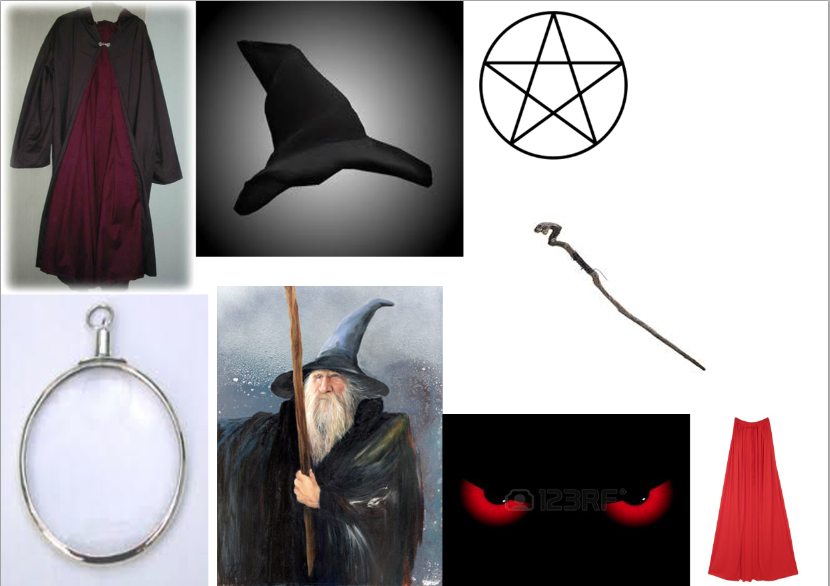
I wanted to base my character around a very dark Gothic style that could shock the player and give them a shock feel of how the character looks and by how his personality matches how he looks.
After I did some research, I then done a quick concept of the character that I wanted to make and thought he looked really good for being made digital and to make him look realistic and feel alive and fleshed out as a character.

I then coloured him in and made him using digital colours on Photoshop for him to stand out and look well by adding his features that I included on my mood-board and sticking to my idea of my character.

I really enjoyed making this character and was happy that I made it as it is a character that I really like and can't wait to use it for a video game in the future so that I can show off his personality and flesh him out as a character for people to interact with and get to know.
Our next project after we made our character, was to design a game map/level that we would like to use for a video game for players to know where they are going for if they get lost or confused on where to continue next.
We first designed a sketch for our level and just to show the basic layout of the level for people to understand what it would look like and get a sort of reference of how the area would feel and look from a top down perspective.

After we got the main basic layout of our map, we then added a little more detail to each bit of the map just to make it seem more realistic and more lifelike and something that could actually be used in a video game.

From the above picture, I wanted to design a map for a basement/dungeon sort of area and the lines are resembling a cracked sort of flooring across each of the rooms to give a sort of old feel to the area and seem like it's very worn out. I then proceeded to finish the rest of the rooms for each of them to have that cracked flooring in each room

This was my final area for my basement and then proceeded to digitalize it on Photoshop or any program of our choice that we work well with. I'm not particularly happy with how my final design looked on paper but I got a brief idea of how I wanted it to look for when I was going to make it look on Photoshop.

Once I had gotten the basic layout of the floor and used the brush tool to colour it in, I then started to add more detail to it to make it more realistic and a lot more lifelike.

This then stuck as my final idea and was what I was originally wanted before I did my final sketched design, I wanted to give that very basement/dungeon look to the place with cobwebs around the area, blood stains and splatters on the floor, cracks that cover most of the rooms and that old, paved grey flooring to each of the rooms. I am really happy with how this design turned out and would like to use this for a video game in the future that I would like to make.
The next project that we started on after we designed our maps, was to design an in-game environment of a game that we'd like to make in the future similar to how concept artists draw areas for reference for when they're making a video game. We had to take many different points into reference such as perspective points, shading and much more.
We first designed our area and sketched it out on paper so that we could use it for reference so that we would know what we're making for when we we're going to digitize it on Photoshop or any program of our choice that we work well with.

With my design, I wanted my game to feel like an FPS (First Person Shooter) and have that camera look that an FPS would have as well. Above is the sort of view that I wanted to have for how it would look while you're playing the game, I used my previous project my map as reference of how I wanted the flooring and walls to look for when I was designing this area and knew what colours and things I wanted to use for when I am designing the area on Photoshop.
I then finished designing my area on Photoshop and gained this as my finished result which I'm very happy with and it turned out very well and exactly how I wanted. I like the different features that I've added to give it that creepy and scary look that this basement/dungeon would have such as the spiders hanging from the ceiling, blood dripping from the ceiling, something watching you from the ceiling, the skull, cobwebs and blood stains also. I'm very happy with how it turned out and would like to use this as concept art for if I were to design a game in the future.

As I wanted to use my character and environment in the same game, I decided to mix both of the designs together to make it seem more lifelike and to make it seem like a piece of concept art. I feel that it looks really good and that both of the designs match really well and would seem like a video game.
