Thousands of years later came the Egyptians. The Egyptians were very good story tellers and would tell stories in many unique ways to get it across to their people.
Firstly, we will talk about some of the paintings that Egyptians did, they would tell some stories through paintings which would show characters portrayed with interesting different views such as in one picture painting where the head is from a profile view and the body is in a frontal view which gives it quite a unique effect when looked at. The Egyptians used very basic colours when creating these paintings such as red, blue, black, green and gold. This became very important for animation later on as the characters in the paintings were quite detailed and this would help animation in being able to draw characters and creating characters also.
Secondly, we will talk about papyrus which was a thin paper like material that was used in creating stories during Egyptian times such as The Book of The Dead which was a very popular story during the Egyptian era. The only downside to using papyrus was due to the fact that it was a very fragile material and can be damaged very easily and could ruin a product completely. The best place to keep papyrus was in a library or in a very dry condition area which would keep the material safe, however, even now some of the papyrus products that were kept in that condition are still even damaged now and in a very poor state.
Thirdly, we will talk about Hieroglyphics and the language of the Egyptians. This was very important during the Egyptian era as this was used heavily when telling stories and would be put on pottery items and sculptures as well to tell a story about this specific product. There are over 700 symbols that are written in an hieroglyphic language and can be quite difficult to understand now but was a very important sign of communication to Egyptians in that era.
These are the most important things that affected the art of animation in many different ways thanks to the Egyptians such as through drawings and paintings and through storytelling in general. I really do enjoy some of the ancient Egyptian work as I really do like the ancient feel to it and how it tells stories in quite a dark way and through interesting techniques as well and has helped animation grow very well and give it that feel of animation today.
Below is some examples of Egyptian art that was around during that time such as a papyrus story of The Book of The Dead.
Thousands of years later again, came the Greeks with their art. Greek art is very interesting as it didn't bring any new techniques or styles to the table when it comes to animation but was heavily focused on the human anatomy, especially the male and saw it as a dominant hero type figure which is why a lot of Greek statues and sculptures were made as a sign of a god such as Zeus or Hercules or as a gift to an emperor. Greek art was only quite popular in Greece for most of the time and didn't really become global for a while until the Romans came around.
The Romans took the Greek idea of the human anatomy and helped spread it across the world which really did help as the anatomy of a human wouldn't be good as what it would be today. As said before, the Greeks mostly looked and studied on the anatomy of the male hero figures and would then make this into pieces of art such as sculptures, statues and two dimensional art also. The pieces of art would be portrayed in athletic poses in both the sculptures and two dimensional art.
Even though art has evolved heavily since the Greek era, artists must learn the basics of the human anatomy like the Greeks did and it is a great representation before artists and animators can take their art in a more modern direction.
Below, is a statue of a Greek emperor or God by the looks of it that was made during that time most likely as a gift to show him as a hero.
From now, I will be talking about the different types of animation that we have today in three different categories, Stop Motion Animation, , it will be in a simple format talking about that method of animation and what it belongs to, I will also be talking about which companies use it and how it is used today in some cases providing examples for people that may not know.
First off, I will be talking about Flip-book animation which is a type of stop motion animation that is quite popular for young animators nowadays. It is a very good style of animation if you're good at drawing as it can boost your skills in drawing quite a lot. A flip-book is a small note pad that contains drawings on each page which you can then "flip" to create an animation. The first famous flip-book animation was created by John Barnes Linnett in 1868 and was named the "kineograph" which means moving picture. Flip-books are very cheap and simple to make but can be quite tedious as it requires a lot of drawings and requires the person to know how frames per seconds work to know how fast the animation is moving. Flip-books are not really made in the media nowadays as it is mostly used as a small source of entertainment that you would normally find on Youtube and other video websites. Since Technology has been evolving, it is now possible to be able to make digital flip-books which I feel ruins the feel of it and doesn't have that same effect like it does when normally drawing a flip-book animation. A lot of talented people such as people on Youtube have made some incredible animations using flip-books which I would encourage you to look at if you want to get into animation as it is a very good way to start off. One of the best tings about flip-book animations is that you can design whatever you want and make it really interesting with how the effect looks from a flip-book animation. Overall, I really enjoy this type of stop motion animation and I would encourage anyone to make one if they want to get into animation.
Below, is one of my favourite flip-book animations that is based off one of my favourite films also which is the Matrix.
The next type of Stop Motion animation that I will be talking about is Cutout animation which is another very simple form of Stop Motion and is very simple to make again. Cutout animation is made using pieces of material such as paper or cloth and then using the cutout pieces to form it into an animation. It is another interesting type of Stop Motion as you can let your imagination run wild and it can come up with some interesting types of stories and adventures using this type of Stop Motion animation and it can become really good. One of the downsides of Cutout animation is that some people may be put off by the visuals of this type of Stop Motion animation and might not find it enjoyable to watch as it lacks some major techniques that other types of Stop Motion animations. Some major Cutout animations include Monty Python's Flying Circus and South Park (In some of the early episodes until it went digital.) Stop Motion died out quite easily by digital animation as it is possible to do a lot of different types of Stop Motion animation digitally which I feel loses the aspect of some of the different types of Stop Motion, however, when it is digitally it does keep some of the aspects to make it seem cut out still.
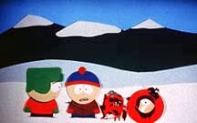
Below is some pictures of some of the early South Park episodes and some pictures of Monty Python's Flying Circus.
The next type of Stop Motion animation that I'll go into will be Clay animation or mostly known today as Claymation. Claymation uses figures made out of clay or a similar material to create a Stop Motion animation. The clay is used to create different things such as characters, scenery, objects. This is quite an old technique dating around 100 years ago and was originally called Modelling Extraordinary but it was used very little. Claymation can be quite an expensive form of Stop Motion animation as you need the right clay, the right colour and tone of clay, and a lot of clay which does all add up to make it very expensive. Claymation is very time consuming also since it requires good lip syncing, anatomy of characters etc. This type of animation is used in many different types of the media such as video games like The Neverhood and films and programs such as Wallace and Gromit and Morph. Due to the increase in technology, a lot of Claymation animation is done digitally and really keeps that clay feel to the characters and the atmosphere of the animation also. I really enjoy this type of Stop Motion animation as I enjoy how fluid and how crisp some of the characters are and how it feels really realistic.
Below is an example of some pictures of Wallace and Gromit and Morph and you can see from the look of the characters, the scenery and the objects that it all looks like it's made of clay.


The next type of Stop Motion animation that I'll be talking about is Silhouette Animation. Silhouette Animation is a very similar to Cutout animation but is slightly different as the characters are only visible as a black silhouette which is why it's called Silhouette Animation. This type of animation is very monochrome as well and has a very interesting vibe and creepy style to it which is very interesting. As said before, Silhouette Animation is very similar to Cutout animation and that you need to cut out the pieces to make your animation, however, due to the increase in technology, it is possible to do this on computers using some programs such as Photoshop or Gimp. This method is used quite a lot in the media, a very good example of this type of animation is a video game called Limbo which uses this type of animation very well and keeps that creepy style and vibe to it and gives it a great atmosphere for the player. I feel that this type of animation should be used a lot more as it even adds some expressionism to the style as it comes from the animator's imagination and the animator expresses their ideas in a silhouette sort of style.
Below is the trailer for Limbo showing off its style and vibe in a very good way for people to experience.
The next type of Stop Motion animation that I'll be talking about is Model Animation. Model Animation is using models made using wireframes inside the body to make the character seem animated and then to have it interact in part of a live-action world. To make characters interact with people and the live action world in general is to use split screens and other similar effects to blend it in with the live actors and settings. This type of animation does blend itself in with Live Action Animation, a great example of this is the original King Kong and how he interacts around with humans and objects in the real world such as the final scene with King Kong on the skyscraper building and him interacting with the real world using that. This is considered a staple of Model Animation and is something that is looked back at nowadays for people wanting to make Model Animation. Model Animation died out quite a while due to technology in 3D animation and making the characters a lot more fluid and making them stand out whereas with Model Animation that the characters aren't as fluid but was considered very good for it's time.
Below is the scene from King Kong of him on the skyscraper and him interacting with the real world in the film.
The next type of Stop Motion animation that I'll be talking about is Object Animation which is a very popular style of Stop Motion animation and is used a lot in this generation as it is quite simple to make and to take frame by frame pictures to then make into an animation. Object Animation uses inanimate objects to then animate into real objects that have character and creates a good atmosphere as well. A great example of Object Animation is using Lego to make an animation. Lego is a very good inanimate object to use in this Stop Motion animation as it allows you to create whatever you wish and is very easy to use and to add frame by frame by adding brick by brick to the objects. I really enjoy this type of animation as there are a lot of different types of Object Animation using other inanimate objects rather than just Lego and other simple inanimate objects and it's best to use your imagination to use unusual objects to make it unique and interesting.
Below is a video of an Object Animation made using Lego and is done by using frame by frame pictures to animate it.
The next type of Stop Motion animation that I'll be talking about is Pixillation. Pixillation is very interesting in how it works as it uses real life people to create a stop motion animation. It uses pictures as frames and then putting all of the frames together to make it seem like a person is moving such as jumping or sliding across the floor. This allows the the person who is making the animation to use many surreal effects and allowing disappearances and reappearances also. I really do like this type of animation and I've worked on a pixillation animation myself so I'm used to how it works and I really enjoy all of the different effects and other things that you can do by taking frame by frame to make this type of animation. This type of animation is sometimes used today to test frames for new animators and to show how frames work but other than that, it is rarely used.
Below, is part of a very popular pixillation animation called The Secret Adventures of Tom Thumb by the Bolex Brothers who are a famous indie animation company based in Bristol.
The final type of Stop Motion animation that I'll be covering will be Puppet Animation. Puppet Animation, as you may of guessed, uses puppet figures to interact as characters in an environment to create a type of model animation. The puppets have little wire frames inside their body to keep them still and up right and to be able to move specific joints to be able to animate them and to include them in an animation. This uses frames just like other stop motion animations to create an animation by moving the characters frame by frame. I really like this sort of stop motion animation and would like to try it myself as it seems really fun to do after seeing different types of puppet animation from Tim Burton's works such as The Nightmare Before Christmas, Corpse Bride and Coraline.
Below is one of my favourite parts of The Nightmare Before Christmas and demonstrates puppet animation very well and how the puppets react with the environment and other scenery also. In 2009, this was also updated to be in a higher quality making it the first animated feature film to be entirely converted into 3-D
There are a lot more different types of Stop Motion animation but these are the very popular types of this style of animation that people enjoy and know.
The next style of animation that I'll be talking about will be Computer Animation or CGI (Computer Generated Imagery), this is a very popular type of animation that is used in the everyday world and is used in a 2D and in a 3D sense. It is my favourite style of animation and it amazes me how better and better it gets from how it looks and how life-like it can feel sometimes when it comes to the characters, environments and objects. I will be talking about the different types of Computer Animation and how it is used in the world today and which companies use it by providing examples.
The first type of Computer Animation that I'll be talking about is 2D Animation which is a very basic type of Computer Animation using 2D bitmap or vector programs to create an animation such as Flash and Pivot. These basic types of animation are really easy and fun to use if you want to start out animating and demonstrates 2D Animation very well and shows it's style very well also. As 3D Animation is a lot more developed and a lot more appealing towards an audience, 2D Animation has died out in some aspects of the media such as video games and old TV kids shows. A lot of 2D Animation is used if you want to create a style out of it that you or others may find appealing. \
A lot of digital animation uses a mechanic known as layers, this allows for you to create different layers with drawings on each and then to merge them together to create an animation (Sort of similar to how Cel Animation works, just digitally.) This allows for a lot of effects to be used such as merging 2D Animation and 3D Animation together to create a good view or appearance and to make the animation stand out.
As said before, 2D Animation is very popular among new animators and is a great way for starting out to do this type of animation as it gets you ready for 3D Animation and teaches you about certain mechanics while learning 2D Animation.
Some famous companies that used to use 2D Digital Animation (Before they developed in 3D) Include Disney with films such as Aladdin, Beauty and The Beast and The Lion King and Studio Ghibli with Spirited Away, Howl's Moving Castle and Princess Mononoke
.
Below, are some of my favourite 2D Animations that I really enjoy from the list above such as Spirited Away and The Lion King. Below, is a trailer for both of the films during the time of it's release to the public.
I felt that this would be a good type of animation to use for when we make our final animation as it would be fun and simple to play around with Flash and to learn how to make an animation in it's base form.
The next type of Computer Animation that I'll be talking about will be 3D Animation which is using digital models edited on 3D modelling programs such as Blender, Maya and RenderMan (Software that Pixar use.) After this, it is then manipulated by an animator using a surface mesh and a digital armature to create the bones and sculpture of the character and adding this allows it to be very lifelike using realistic movement and adding different techniques such as gravity, particle simulations, simulated hair/fur, and using fire and water effects and adding it to an environment.
3D Animation is everywhere, nearly everything has some sort of 3D Animation as people get really appealed by the look of it and how lifelike it looks. It is also used in different aspects of the media such as Film by different animated companies such as Disney, Dreamworks and many more and in video games as well by different Triple A companies such as EA, Blizzard, Activision and many more. A lot of 3D Animation when developing characters is made using a mechanic know as "Motion Capture" using special suits that allow the animator to capture that figure and be able to use it to add into a video game or to add into an animated film.
3D Animation is very high tech and is evolving every day with people coming up with new ideas and making characters, scenery and other objects look even more real to appeal to the human eye for someone to watch and enjoy.
A lot of famous films have been made using 3D Animation such as Toy Story being the first digitally animated film to be made just using computer imagery, this was revolutionary for it's time and gave a lot animation companies new ideas and a lot more to work with and to create, other famous films done using 3D Animation include Wreck It Ralph, Finding Nemo, Up and WALL-E by Disney. Shrek, Kung Fu Panda, How to Train Your Dragon and Shark Tale by Dreamworks.
Companies such as Universal Studios created films using 3D Animation also such as Jurassic Park which uses 3D Animation to be able to create the Dinosaurs and to have them react very well to the actors. They also developed E.T and Jaws which were mega box office hits and allowed 3D Animation to seem a lot more real and developed to make them act around with the actors similar to how Jurassic Park allowed the dinosaurs to act around the actors.
The amazing thing about 3D Animation and 2D Animation is that you can make anything look almost lifelike and give it your own style and feel. As you can see with the trailers below, they are all done in their own style and it makes them really stand out and appeal to people very easily by how lifelike it looks.
Below, are some trailers for some of my favourite 3D animated films and video games, Wreck It Ralph, World of Warcraft, Diablo and Up.
As these are the only two types of computer animation, their are other small things that goes into these types of animation and other types of animation as well known as Limited Animation and Full Animation.
Full Animation is the process of making high quality animated films that don't have much detailed drawings or plausible movement, this is used in feature films that are in the box office during the time for people to see. Full Animation doesn't have much style as it will seem very similar to other films of its time and wouldn't have its own unique style to make it stand out and feel different from other films. Full Animation also uses pre-made stock footage to save up for making new designs.
Limited Animation is the opposite of Full Animation. Limited Animation involves less detail, but uses more stylised drawings and other unique methods that the animator wants, Limited Animation is used for when the animator wants to create his own style and for it to feel different than other animated films that other companies may of worked on. Limited Animation allows you to make loads of stylised drawings and designs in all forms and shapes and wouldn't be the same thing again and again.
These are very important to take into factor as it can change your animation entirely and depends on whether you want to add your own style to it or not, or to use stock footage again and again. It is very important to decide this before starting pre-production on an animation so that you know how to make and how to use the footage instead of changing it during production.
Below, are some Limited Animations and some Full Animations so that you may see the difference between the two in an animated film. The Limited Animation being The Yellow Submarine which is a film about The Beatles and is done in an interesting art style making it a limited animation. The Full Animation being Ice Age in an animated style similar to other animated films making it a Full Animation.
I will now go into the different types of animation that people may not know about, or know about but have only heard about it and don't have a lot of knowledge about it.
The first type of animation that I will talk about that people may not know about, is the magic lantern. The magic lantern is essentially an earlier version of the modern day projector which we use to show images and presentations. The magic lantern was used by using a painting and then using a very simple lens and shining it with a candle or oil lamp, this is so that in a dark room the image would appear on a flat surface such as a wall. One of the main things that it was used for was to project supernatural images or demonic images to convince people that they are witnessing supernatural forces. Some slides also contained moving parts which made the magic lantern the most earliest known example for projected animation. This is a very old device in itself that was developed in the early 17th century. The earliest known magic lanterns were developed and used by Christiaan Huygens and Athanasius Kircher which is who most people would give their credit to for making this device.
Below is a video of how the magic lantern would work and shows a bit of projected animation done by using the magic lantern.
The next type of animation that I'll be talking about that people may not know about, is Sand Animation. Sand Animation is where the animator will create a series of images made out of sand, the animator will use sand over a light source such as a light box or a projector to create these images. The images include drawing lines and figures and then using the different images to make an animation. One of the best things about this type of animation is that it gives a very interesting and unique effect when animated due to the light contrast that is in place with the sand. This is quite a new type of animation that is quite new from the late 20th century. Some notable animators who use Sand Animation include Alexandra Konofalskaya, Su DaBao, Joe Castillo and Ilana Yahav.
Below, is a video of how Sand Animation works and shows the light contrast effect also and how interesting and unique it is.
The next type of animation that I'll be talking about that people may not know about, is Pinscreen Animation. Pinscreen Animation is the process of using small movable pins filled over a screen that can be moved in or out to press an object onto a screen. This is so that when the screen is lit, the pins creates shadows which look very interesting and unique. This animation technique has been used to create some animated films due to the wide range of textural effects that you can use with these pins that is difficult to achieve in other types of animation. This is quite a new technique that was created in the middle of the 20th century. It is widely debatable from some people of whether this is a type of animation or not as it's no different from Stop Motion Animation and Sand Animation.
Below is a video of a popular animation that is done using Pinscreen Animation called Mindscape which is done by a popular Pinscreen artist, Jacques Drouin.
The final type of animation that I'll be talking about that people may not know about, is Paint-on-Glass Animation. Paint-on-Glass Animation is a type of animation that is used for making animated films by using oil paints on a sheet of glass. The paints are then manipulated on the sheets of glass to create an animation that looks really breath-taking and keeps you in awe in such a beautiful way. This is also quite a new technique that was developed in the late 20th century.
A very famous Russian animator by the name of Aleksandr Petrov created a very popular Paint-on-Glass Animation known as The Old Man and The Sea. Below is a video of the animation.
I hope you enjoyed this article of different types of Animation and I hope that it has helped you learn some new types of animation and some that you may already know and wish to jog your memory.
Task 2 - Complete a storyboard with soundtrack and planning documents for a popular story.
Before we started work on our animation, we first were told about an English folk tale story that goes by the name of Yallery Brown. We were told to read up about the story and circle some different parts of the story while we were reading through it to get some idea of what different parts we could animate in the story.
Once we had read through it and circled some different parts of the story, we then did some development on which parts we could animate and how we could animate it. Below were some of my designs of different scenes that I could have made and animated in Flash to tell the story.
Once we thought of some ideas that we could use for our story to be able to tell it. Before we started doing our storyboards, we had to choose a character from the story to use for a walk cycle animation to show that we can make a walk cycle. I chose Yallery for my walk cycle as I felt that his character would be interesting for him to do as he's the size of a gnome and that he has a lot of hair which would change the sound effect for him walking.

Once we had developed our character, we then had to digitalise it and create it so that it would work for our animation. I went through a lot of different designs for Yallery as I was unsure of how to do the hair for him and how to give it an animated feel to it. Below are some of the designs that I used for Yallery and what the final design was.

After making these three designs, I finally came up with my design for my character walk cycle that I thought would work well and would act as if he was real, however, it seemed very unrealistic when people looked at it so I wanted to change it to be more fluid and lifelike. Below, is my pre-final design for Yallery and then my updated Yallery for my final animation (Left is old Yallery, Right is new Yallery.) As you can see from the two, the second one is a lot more fluid and has a lot more frames to it to make it seem a lot more lifelike and to make it seem like a real character moving.


Once we had developed our character and finished our character walk cycle, we then began work on our storyboards and decided to choose how the story would go in our eyes. We done a draft design and then a final design both differing from each other to show that we have improved and added news scenes and such to our story. Below is my first draft of my storyboard in very basic detail for people to understand and see how the story would go.
Once we developed our draft design, we then began work on our final design to use for reference for when we are making our final animation. Below is my final storyboard for my animation in a lot more detail and in a better standard.
After we made our storyboard, we then started development on our two minute animation and getting it ready to show to our class.
Task 3 - Produce a stop frame animation of a character walk cycle with soundtrack
This is my walk cycle for my character that I've developed on Flash, i found this quite a big task as I was quite new to Flash and I didn't have a lot of experience. I also added sound to my animation to give it a sort of realistic effect and to sync it with the actual walking of the character. I really did enjoy making this walk cycle as it has helped me a lot for when I developed my final animation to submit for my deadline. Below is the video of my walk cycle which I've also added in my final animation also.
Task 4 - Evaluate audience responses.
Once we shown our animations to each other in class, we then gave feedback to each other on how we can improve it for when we make our final animation which would be two minutes long so that we could get an even higher grade as we listened to people and listened to feedback and would improve it while making our two minute animation.
I gotten feedback from quite a few people and one of the biggest things was the actual walk cycle itself, people really liked the run cycle but it's very fast paced and that there isn't many frames to the cycle which is what makes it look really fast paced and quite unrealistic. People said to me that the way of improving this would be to add a few more frames to the walk cycle so that it'll look smoother and make it look more realistic. Another problem I got was about sound quality and that the actual sound wasn't very loud which I knew I would of had to improve for when I was going to make my two minute animation as it would lose out on aesthetic and realism.
Overall, people really enjoyed my walk cycle animation and then I was ready to start developing my two minute animation and taking these factors into account so that the same mistakes wouldn't happen again.
Task 5 - Produce a final animation for a popular story
This is my animation based on the popular Northern English folk tale, Yallery Brown and explaining the story in Flash as a 2D type of animation.
One of the problems with my animation that I was unable to fix was syncing the sound and the animation put together as Youtube was naturally unsyncing it both which I wish I could improve if I was to do it again.
Evaluation Redone
In this
project, we developed an animation based off an Northern English Folk
Tale by the name of Yallery Brown which is about a farmer boy finding
a gnome like creature under a rock that grants him a wish but leads
to disaster.
One of the main
things that I have learned from doing the animation from doing this
project is using the program, Flash. Flash is a 2D animation program
that is very good for beginners wanting to get into animation and
learn a lot more about it. I really enjoyed using this program as I
feel it is very good for wanting to get into animation and is quite
easy to learn about the different things that come into animation
such as frames, the artwork, storyboards, the fps (Frames Per Second)
and more. It allowed us to learn animation for if we were to ever
make an animation again for another project or to make one in our
spare time. We also learned another program that allowed us to learn
more about sound files and how to use them in different projects
which was Audacity. I also developed on many different skills that
I've wanted to improve such as my drawing skills, technical skills
and program skills such as learning a lot more with Photoshop and
Illustrator and allowed us to learn new techniques so that we may use
them again in the future.
The point of
this project was to learn about animation and how characters in game
design and animations in general of how they move, act and control
which allowed us to learn a lot more about character design and will
help us greatly for when we get more into games design and eventually
make our own game with each character having unique animations that
make them seem more realistic and lifelike and unique as they use
their own animation instead of using the same animations for each
character and not some sort of moving figure. This will help us and
be very useful for us in the future when we make another animation or
a game with animations in it and to learn how characters work. I'm
glad we've did this project as it will really help for when we do
future projects involving animation and will allow us to learn more
things and become better at animation or subjects similar to it.
As this was a new program for me, I had a lot of different problems and a lot of trouble when making this animation. One of the main things was that I was unable to work on it in college due to my version of my Flash not being able to work in college and meaning I'd have to change the format on a computer with an updated Flash program which proved to be a huge pain. There were some successful things however and some parts that I did enjoy such as doing my voice acting and having a lot of fun with as it was something that I would of liked to add to my animation and thought that it would suit my animation quite well. Other things that went well include the fact that I was happy developing on my current skills such as drawing and using different programs as it contributed to my work very well in that it helped me get to where I am today with this unit. Some other things that didn't go well was getting everything in on time and having problems with uploading work to my blog and to other sorts of websites for the class to be able to see it and criticize on it and give feedback which won't happen again as a lot of the problems were on my end and I'm sure it wouldn't happen again as I've gotten use to the different websites such as Blogger and Youtube which I know how to do a lot of the things on there now. This helps contribute into my work in some way of that it teaches me websites that will help us in the future for when we want to show our media for a portfolio or for an interview to show our work and it's good learning these websites now for if we want to make a portfolio in our spare time.
Overall, I felt that this animation was quite a rough start for me at first as I never had experience with some programs like Flash and some aspects of Photoshop and Illustrator but got better as the unit went on and I was able to get it all ready to hand in so that it was ready to show and gain feedback on. I know that for my next project/unit I can improve by knowing what to do with each program and how different websites such as Blogger and Youtube work so I wouldn't have problems with them in the future. It was good also learning new skills and developing on skills I currently had such as drawing, computing, idea generation and more. The overall process of this animation went well I feel though and I really did enjoy making it for when I got the hang of it and would like to use Flash in the near future to develop my skills even more to be able to make more animations for something that I would like to do.
I feel this unit went very well and if I was to grade myself, I'd give myself a 6/10 as I feel I didn't do too badly but not too good either and I would like to improve this for the next project that I do and be able to show that I want to learn different things and to be able to get it all ready on time to show and presentate.


.jpg)